Today is the 40th anniversary of the publication of what the Times calls J.G. Ballard’s ‘finest novel’, High-Rise. The compelling and unnerving tale of what happens when life in a luxury apartment building descends into chaos, High-Rise has never been more relevant, in a world where luxury flat advertisements capture the Ballardian essence far more completely than any earnest filmmaker ever could.
The 40-year milestone for this key Ballard text is being marked next year, with the release of Ben Wheatley’s film version starring Tom Hiddleston. As Ballard’s proud publisher, we’re fondly looking back at the designs which have graced the book over the years…
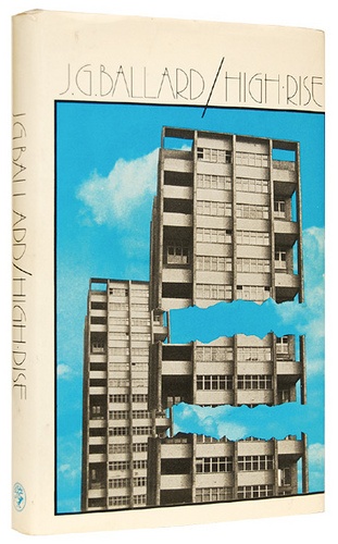
1975
The novel was published in hardback with the cover below in 1975, by Jonathan Cape. This initial design proved iconic – the book’s main theme neatly captured by impossible, violent architecture of the skyscraper at its centre. The typography, too, has endured – on our recent paperback reissues, we followed the tradition of separating the author name and book title with a striking forward slash.
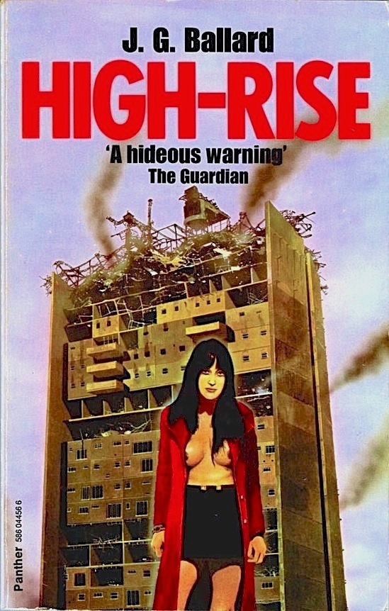
1977
When Panther issued the book in 1977 they opted for a more pulpy look, retaining the ruined skyscraper motif but adding a scantily clad woman. The book features some pretty repellent scenes, but nothing quite as disgusting as this cover. ‘A hideous warning’ indeed – to graphic designers worldwide.
1985
In the mid-80s Panther tried a different, much more successful approach, tapping into the artwork adorning record covers by Ballardian synth-stars of the time such as Gary Numan, The Normal and The Buggles.This design is unarguably of its time, but retains a nostalgic charm, pleasingly redolent of a time where a young pop fan might be seen with a Ballard paperback in their pocket on the way to a gig.
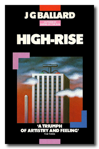
1989
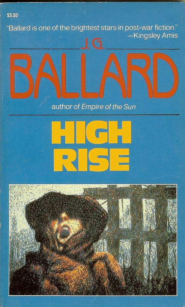
The titular high-rise loses status on the cover of Caroll & Graf’s 1989 edition, becoming more of a backdrop. The illustration isn’t quite on point, looking more like something from the Blitz. But it’s interesting to note that post-Empire of the Sun, Ballard’s name is established enough to take up acres of cover space, dwarfing the novel’s title.
1993
By the 90s the skyscraper motif had been abandoned entirely, Flamingo opting for an elegant, minimal cover featuring a witty molotov champagne bottle illustration. This cover signifies Ballard’s shift from being branded as a purveyor of Science Fiction to being introduced as a Serious Writer of Literary Fiction, and although he was doubtless both, it’s interesting to see a cover focused on the relationship between luxury and revolutionary violence rather than dystopian architecture.

2006
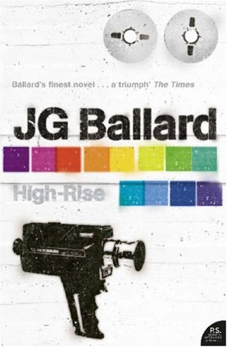
In 2006 the novel saw its first 4th Estate cover, part of a whole-backlist redesign in a minimal, graffiti-esque style that firmly placed the novel in the 21st Century, a world it had confidently predicted.
2014
We most recently redesigned Ballard’s novels again in 2014, this time with help from Radiohead designer Stanley Donwood. In producing the 21 cover designs, Stanley worked with scientists in their laboratories, using acids, combustion, X-rays, chromatography, and various other experimental techniques – working with the instinct that Ballard regarded his writing as a sort of experiment itself. The results were stunning – and High-Rise was one of our favourites, Stanley subtly reinstating the skyscraper/brutalist architecture that adorned the early covers and submerging it in a dreamy colourscape that is entirely his own.
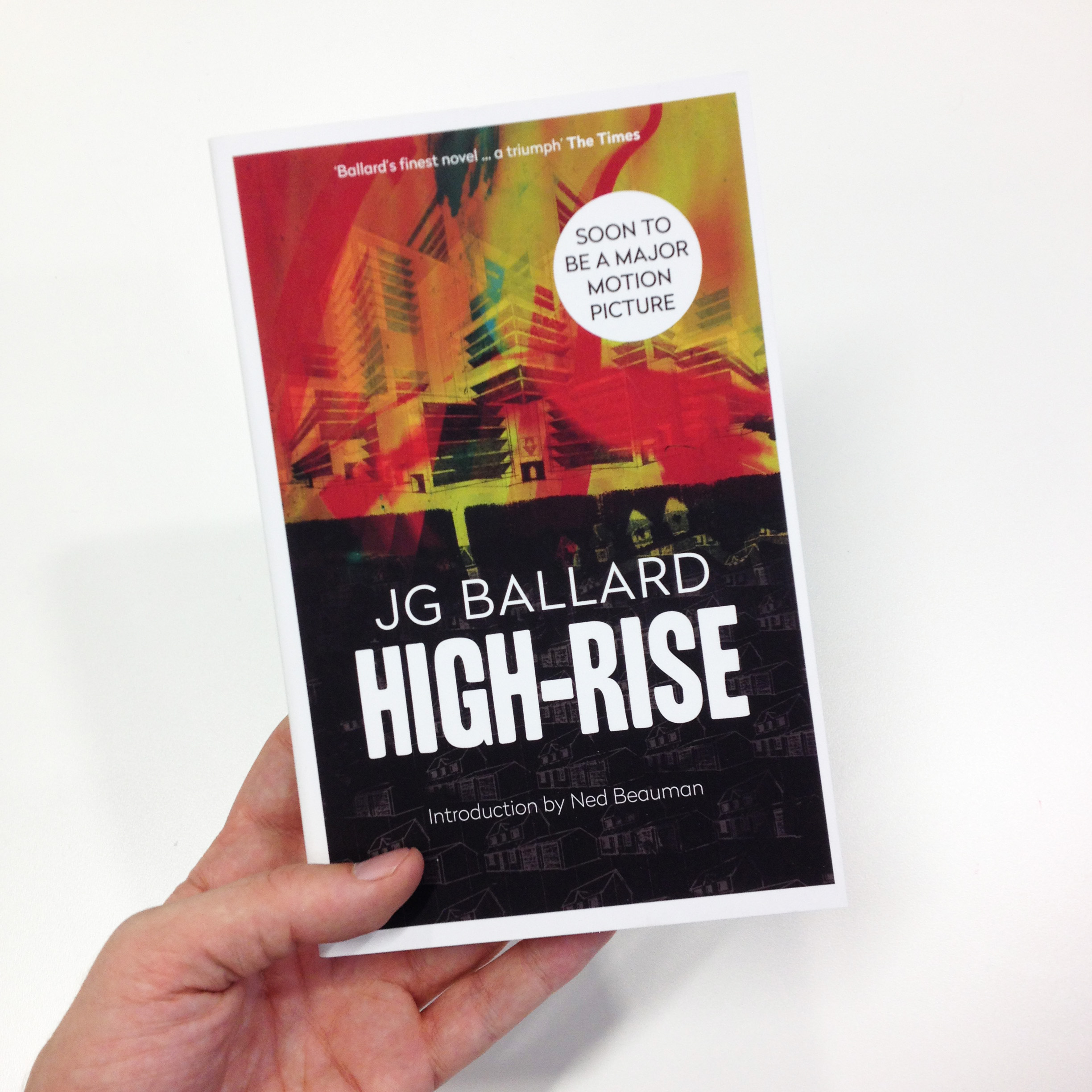
High Rise is out now in paperback, with a cover designed by Stanley Donwood.

